Over the past two years we focused on modernizing the look of our application and improving our features to make them easier to use and even more configurable. Throughout all of this change, there was one thing that had stayed the same–our logo. Starting today you’ll see new branding, new resources and industry specific feature documentation. We want our website to reflect the time and care poured into our product.
Changing our logo was a task that we took very seriously, as it involves looking at our business as it stands today and creating an image that represents what we want to focus on as a company going forward. We looked at various color combinations and designs with a focus on creating a new mark that is simple and expressive. Our new design focuses on the “R” and uses two shades of blue to highlight one of our defining features–two way chat hidden in the negative space. Our mission is to continue to build amazing technology that helps connect companies with their guests in innovative ways. We feel this new logo helps express that desire and we look forward to using it for years to come.

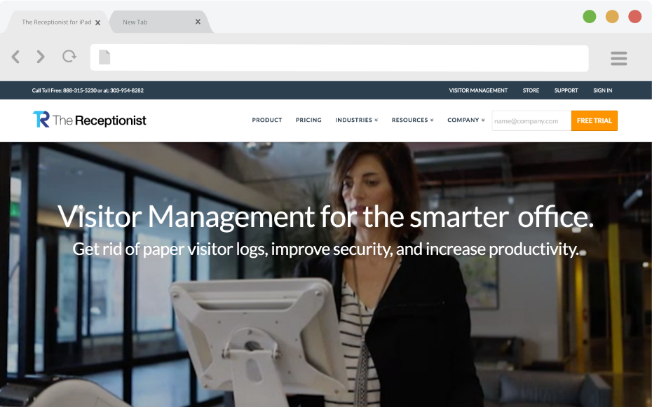
After many months of hard work, we are also pleased to launch our redesigned website.
Our goal with the new website is to provide a clear and easy way to learn more about The Receptionist and how the product solves real world problems. This new site will offer our current and prospective customers information about our product. It also acts as a foundation for us to create new content that helps speak directly to the wide variety of industries and use cases that our product helps support.
We hope you enjoy our new look and would love to hear your feedback. What do you think?
Share this Post